

Twitter Sentiment Analysis
There were a couple of contradictory political events in Hungary lately and the below code tries to capture the reaction of the public by applying sentiment analysis on tweets from Twitter using 2 search words:
- ‘Viktor Orbán’ - the current prime minister of Hungary
- #istandwithCEU - the most used supporting hashtag of the Central European University
The tweets used in this project are from 1st until 14th April 2017.
######NOTE: The project doesn’t want to take a stand on or against any political sides, it only shows an example of how to use R as a data science tool for sentiment analysis. Therefore the results will not be discussed.
I should give a huge credit to the authors of the following 2 blog articles, because the large part of the code used in this project was borrowed from them:
- How to Use R to Scrape Tweets: Super Tuesday 2016 by Kris Eberwein
- Joy to the World, and also Anticipation, Disgust, Surprise… by Julia Silge
Okay, now let’s get started!
Reading the 2 csv files, that has been scraped from Twitter using the twitteR package.
t_orban <- read.csv('/Users/mac/Desktop/Data Science/Pet Projects/Twitter/feed_orban.csv')
t_ceu <- read.csv('/Users/mac/Desktop/Data Science/Pet Projects/Twitter/feed_ceu.csv')
Reading in the dictionary of positive and negative words, which is a list of 6800 positive and negative words compiled by Bing Liu and Minqing Hu of the University of Illinois at Chicago. You can download it here.
good_text = scan('/Users/mac/Desktop/Data Science/Pet Projects/Twitter/positive-words.txt',
           what='character', comment.char=';')
bad_text = scan('/Users/mac/Desktop/Data Science/Pet Projects/Twitter/negative-words.txt',
           what='character', comment.char=';')
The next thing is to load a huge function, which will score the tweets, by searching for the positive and negative word instances in the text.
score.sentiment = function(sentences, good_text, bad_text, .progress='none')
{
        library(plyr)
        library(stringr)
        # we got a vector of sentences. plyr will handle a list
        # or a vector as an "l" for us
        # we want a simple array of scores back, so we use
        # "l" + "a" + "ply" = "laply":
        scores = laply(sentences, function(sentence, good_text, bad_text) {

                # clean up sentences with R's regex-driven global substitute, gsub():
                sentence = gsub('[[:punct:]]', '', sentence)
                sentence = gsub('[[:cntrl:]]', '', sentence)
                sentence = gsub('\\d+', '', sentence)
                #to remove emojis
                sentence <- iconv(sentence, 'UTF-8', 'ASCII')
                sentence = tolower(sentence)
                # split into words. str_split is in the stringr package
                word.list = str_split(sentence, '\\s+')
                # sometimes a list() is one level of hierarchy too much
                words = unlist(word.list)

                # compare our words to the dictionaries of positive & negative terms
                pos.matches = match(words, good_text)
                neg.matches = match(words, bad_text)

                # match() returns the position of the matched term or NA
                # we just want a TRUE/FALSE:
                pos.matches = !is.na(pos.matches)
                neg.matches = !is.na(neg.matches)

                # and conveniently enough, TRUE/FALSE will be treated as 1/0 by sum():
                score = sum(pos.matches) - sum(neg.matches)

                return(score)
        }, good_text, bad_text, .progress=.progress )

        scores.df = data.frame(score=scores, text=sentences)
        return(scores.df)
}
The next step is to apply the previously defined function on the 2 loaded data frame, using the list of good and bad words from the sentiment dictionary. It will add the calculated sentiment scores to another column.
sent_orban <- score.sentiment(t_orban$tweets, good_text, bad_text, .progress='none')
sent_orban <- cbind(sent_orban, date=as.factor(t_orban$date))
sent_ceu <- score.sentiment(t_ceu$tweets, good_text, bad_text, .progress='none')
sent_ceu <- cbind(sent_ceu, date=as.factor(t_ceu$date))
Loading a couple of libraries that will be required:
library(ggplot2)
library(ggthemes)
library(tidyr)
library(dplyr)
library(stringr)
The upcoming barchart will be filled up with 3 color gradient, using the shades of green, yellow and red. Here is how the palette is created:
colpal <- colorRampPalette(c("green3", "lemonchiffon2", "firebrick"))I used a cheatsheet provided by Thian Zheng (associate professor at Columbia University) to grab my chosen colors. It’s a very handy tool: you can quickly select your favourite colors and copy-paste their R names into your script.
The following code will count the total number of tweets per day:
sum_count_orban <-
        sent_orban %>%
        group_by(date) %>%
        count(date, date)
Sentiment scores for the search term ‘Viktor Orbán’
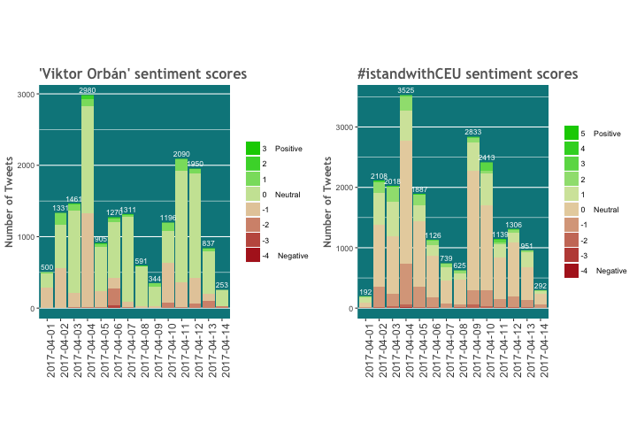
Let’s draw the first plot about the sentiment scores of the first search term.
p_o1 <- ggplot(data = sent_orban, aes(x = date, y = 1)) +
        geom_bar(stat = "identity",
                 aes(fill = factor(score, levels=rev(levels(as.factor(score)))))) +
        geom_text(data = sum_count_orban,
                  aes(y = n, label = n), size = 3,
                  vjust = -0.5, color = 'white') +
        scale_fill_manual(labels = c("3    Positive", "2", "1", "0    Neutral", "-1", "-2", "-3", "-4    Negative"), values = colpal(8)) +
        theme(panel.grid.major.x = element_blank(), panel.background = element_rect(fill = 'turquoise4')) +
        ggtitle("'Viktor Orbán' sentiment scores") +
        labs(y="Number of Tweets") +
        theme(legend.title=element_blank(), axis.title.x = element_blank()) +
        theme(plot.title = element_text(family = "Trebuchet MS", color="#666666", face="bold", size=16, hjust=0)) +
        theme(axis.text.x = element_text(size = 12, angle = 90, hjust = 1),
              axis.title = element_text(family = "Trebuchet MS", color="#666666", face="bold", size=12))
p_o1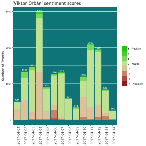
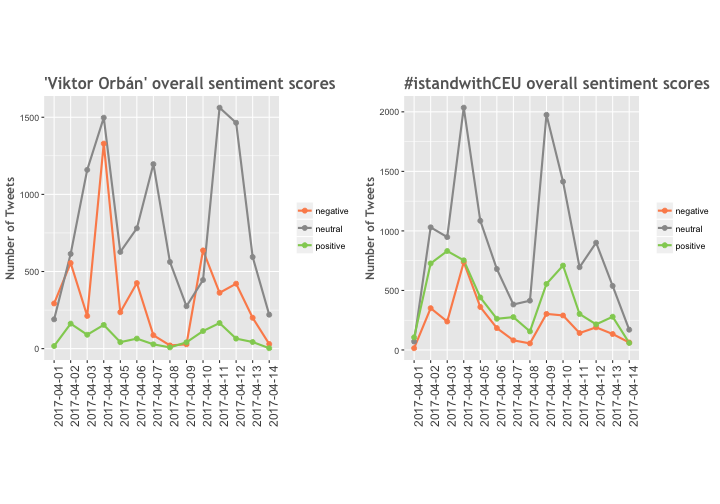
Calculating the overall sentiment scores by grouping the positive, neutral and negative scores.
stat <- mutate(sent_orban, tweet=ifelse(sent_orban$score > 0, 'positive', ifelse(sent_orban$score < 0, 'negative', 'neutral')))
by.tweet <- group_by(stat, tweet, date)
by.tweet <- summarise(by.tweet, number=n())
Plotting the overall sentiment scores:
p_o2 <- ggplot(by.tweet, aes(date, number)) + geom_line(aes(group=tweet, color=tweet), size=1) +
                geom_point(aes(group=tweet, color=tweet), size=2) +
                scale_color_manual(values=c("#fc8d59", "#999999", "#91cf60")) +
        ggtitle("'Viktor Orbán' overall sentiment scores") +
        labs(y="Number of Tweets") +
        theme(legend.title=element_blank(), axis.title.x = element_blank()) +
        theme(plot.title = element_text(family = "Trebuchet MS", color="#666666", face="bold", size=16, hjust=0)) +
        theme(axis.text.x = element_text(size = 12, angle = 90, hjust = 1),
              axis.title = element_text(family = "Trebuchet MS", color="#666666", face="bold", size=12))
p_o2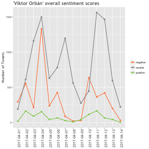
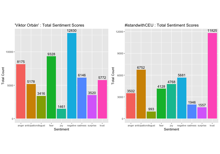
Next stop is emotions!
Now we are trying to dig deeper and unfold the positive and negative feelings by differentiating the various emotions from each other. To make this happen, I applied an algorithm from the syuzhet package, which is based on the NRC Word-Emotion Association Lexicon, done by Saif Mohammad and Peter Turney. It uses a dictionary, where each word has score, that is associated with 8 different emotions.
Loading the neccesary libraries:
library(syuzhet)
library(lubridate)
library(scales)
library(reshape2)
First we have to remove the graphical characters in order to run the NRC algorithm on the tweets:
usableText <- str_replace_all(sent_orban$text,"[^[:graph:]]", " ")
mySentiment <- get_nrc_sentiment(usableText)
tweets <- cbind(text=sent_orban$text, date=sent_orban$date, mySentiment)
After extracting the 8 emotion scores, we can aggregate the numbers for the visualization:
sentimentTotals <- data.frame(colSums(tweets[,c(3:11)]))
names(sentimentTotals) <- "count"
sentimentTotals <- cbind("sentiment" = rownames(sentimentTotals), sentimentTotals)
rownames(sentimentTotals) <- NULL
Let’s look into the data frame that we got:
sentimentTotals## sentiment count
## 1 anger 8175
## 2 anticipation 5178
## 3 disgust 3416
## 4 fear 9328
## 5 joy 1461
## 6 sadness 6146
## 7 surprise 3520
## 8 trust 5772
## 9 negative 12830Now we are ready to plot the aggregated scores by emotions and check their distribution:
p_o3 <- ggplot(data = sentimentTotals, aes(x = sentiment, y = count)) +
        geom_bar(aes(fill = sentiment), stat = "identity") +
        geom_text(data = sentimentTotals,
                  aes(y = count, label = count), size = 4,
                  vjust = -0.5, color = 'black') +
        theme(legend.position = "none") +
        theme(axis.text.x = element_text(size = 8)) +
        xlab("Sentiment") + ylab("Total Count") + ggtitle("'Viktor Orbán' : Total Sentiment Scores")
p_o3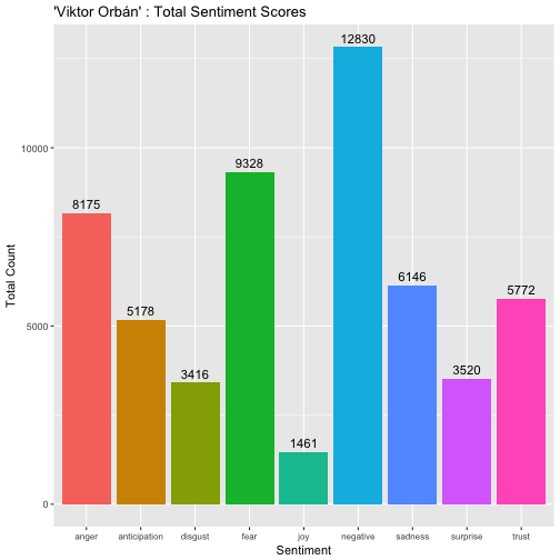
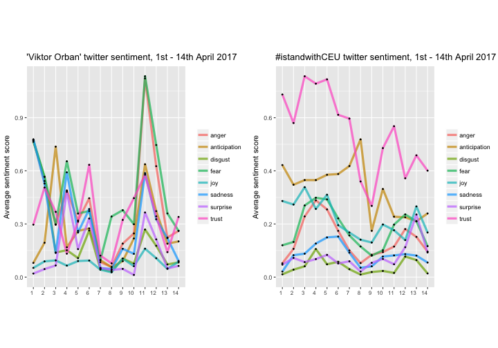
For the last plot, we summarize the average score of the emotions by day. This will give a nice overview of the different feelings changing over time.
To prepare the data for visualization, the mean of the sentiments should be grouped by date:
tweets$day <- date(tweets$date)
dailysentiment <- tweets %>% group_by(date) %>%
        summarise(anger = mean(anger),
                  anticipation = mean(anticipation),
                  disgust = mean(disgust),
                  fear = mean(fear),
                  joy = mean(joy),
                  sadness = mean(sadness),
                  surprise = mean(surprise),
                  trust = mean(trust)) %>% melt
names(dailysentiment) <- c("date", "sentiment", "meanvalue")
The average sentiment scores are ready to be plotted now:
p_o4 <- ggplot(data = dailysentiment, aes(x = as.factor(day(date)), y = meanvalue, group = sentiment)) +
        geom_line(size = 1.5, alpha = 0.7, aes(color = sentiment)) +
        geom_point(size = 0.5) +
        ylim(0, NA) +
        theme(legend.title=element_blank(), axis.title.x = element_blank()) +
        ylab("Average sentiment score") +
        ggtitle("'Viktor Orban' twitter sentiment, 1st - 14th April 2017") +
        theme(axis.text.x = element_text(size = 8, hjust = 1))
p_o4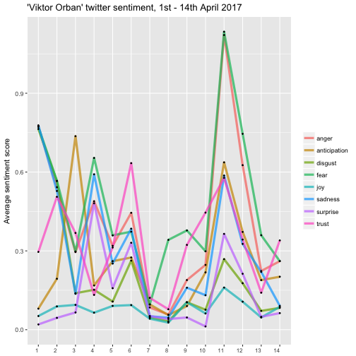
Compare the results of the 2 search terms
We simply run the same code for the second search term and plot the results side by side with the first term:
 —
—
 —
—
 —
—
Leave a Comment